Which Design is More Reliable? Weibull Provides Answers!
Weibull Analysis is often used to analyze field or test failure data to understand how items are failing and what specific underlying failure distribution is being followed by failures that occur. One of our staff engineers was recently responsible for making a vendor recommendation for a limited life item that had a specified 5% minimum life of 16,000 cycles (i.e., no more than 5% of the population was allowed to fail prior to 16,000 cycles). Two competing manufacturers provided the test data shown in Table 1, each claiming their device would satisfy the requirement.
A first inclination might be to select Manufacturer B since the test data indicated a longer average life (52,000 cycles versus 44,000 cycles). However, a further analysis of the data using Weibull techniques reveals this would be a bad choice. The Weibull distribution is a general distribution that can be used to model many other specific distributions, such as the normal or exponential.One simple method to perform a Weibull analysis is by calculating median-rank plotting positions via a simple formula and then plotting the cumulative percentage of devices that have failed versus their failure times on Weibull probability paper. If the data falls on a straight line, as it often does, the Weibull distribution parameters can be easily estimated based on the plot. An even easier approach is to use one of the many software packages available.
Table 1: Competing Manufacturer Life Test Data
|
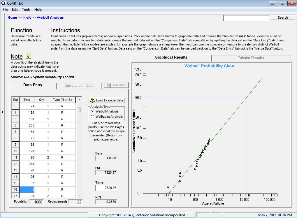
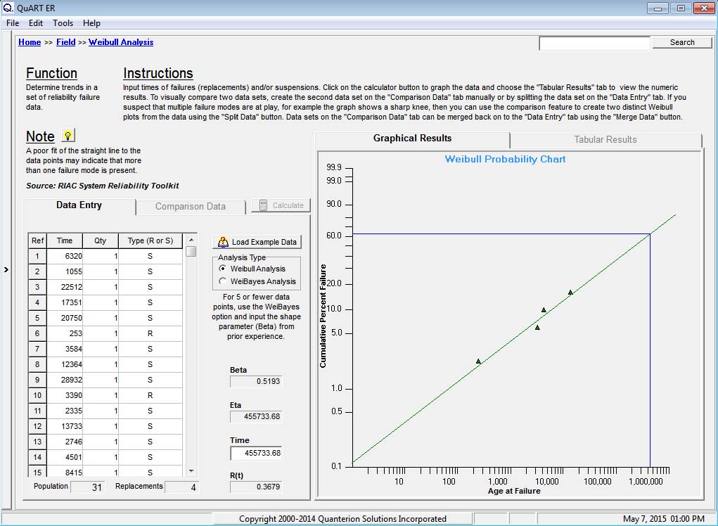
The engineer decided to use the Weibull Analysis module in the free version of the Quanterion Automated Reliability Toolkit (QuART), available at here, to handle the analysis. The resulting Weibull plots for each set of data are shown in Figures 1 and 2. Since both sets of data result in a reasonably straight-line fit, it can be assumed that they fit the Weibull Distribution.
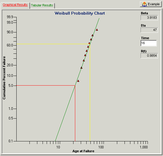
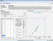
Figure 1: QuART Weibull Probability Plot of Manufacturer A’s Failure Data

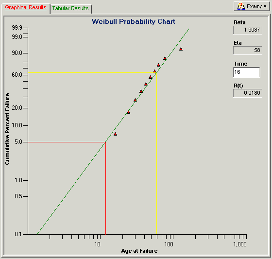
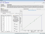
Figure 2: QuART Weibull Probability Plot of Manufacturer B’s Failure Data
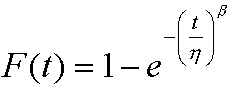
At this point, simply look at the 5% Cumulative Percent Failure point along the Y-axis and follow this across (red line in the Figures) to where it intersects the best-fit straight line, reading the corresponding cycles to failure on the X-axis. Using this method, Manufacturer A’s data indicates a 5% life above the 20K cycle point (well above my 16K cycle requirement) while Manufacturer B’s data is much closer to the 10K cycle point. A more accurate check is to read the Weibull Slope, b, and Characteristic Life, h, for each plot (the characteristic life is that age where 63.2% of the population will have failed (yellow line on plots)) and use the Weibull cumulative distribution function (CDF) given by Equation 1 to calculate the cumulative percent failure at the 16K cycle point (i.e., t=16).
 |
Equation 1 |
Table 2 summarizes this calculation and shows that for Manufacturer A’s design only 1.5% will have failed by this point while 8.2% of Manufacturer B’s components will have failed. The Weibull analysis clearly indicates that Manufacturer A’s design will meet requirements while Manufacturer B’s design will not. This is one example of how to use this powerful tool to understand life data and improve product reliability.
Table 2: Summary of Weibull Parameters and Cumulative Percent Failure at 16000 Cycles
| b(Weibull Slope) | h(Characteristic Life) |  (Cumulative Fraction Failed at 16K Cycles) |
|
| Manufacturer A | 3.9 | 47 | 0.015 |
| Manufacturer B | 1.9 | 58 | 0.082 |